Mercy - a pastel painting by Mary Zore

by Mary Zore
(Brookline, NH)
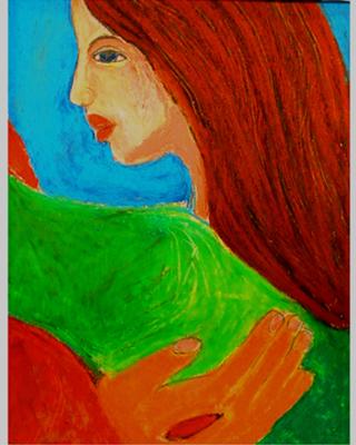
The Savior's Hand--Mercy's Touch (Pastel)<br><b>Mary Zore</b>

The Savior's Hand--Mercy's Touch (Pastel)
Mary Zore

This pastel was created as an image to depict Christ's healing touch.The woman could be any of us who have felt God's touch in their lives.

It expresses my faith that God's arms are always open, and that any pain we have can be changed into joy through His grace and mercy, which is boundless.

Today, many women suffer sorrow from a culture that has encouraged them to have abortions. I have several friends who shared with me the pain they feel over a past abortion.

I know that it must feel like they have done something which cannot be undone. Yet God can turn every situation into good in some way. We must never lose that faith.

Christ's cross and resurrection gives us perfect confidence in His victory over death.

If some woman who feels pain over an abortion, sees this picture, I hope that she realizes that God loves her and that her tears can be turned into joy. God can bring good out of every situation if we will only turn to Him.
Mary

Comments for Mercy - a pastel painting by Mary Zore

Click here to add your own comments

Reply to constructive criticism
by: Mary

Thank you for your comments. I tried your e-mail but it did not work for me. I believe the digital copy of the artwork shows the colors more intensely than they are in the original. The use of bold, striking colors was a prominent part of the 'Fauve" post-Impressionist art movement.

I am generally drawn to expressive artwork that is 'feeling' oriented. The strong colors appeal to me and the flattened shapes as well. The reddish colors are there to indicate the warmth of Christ's touch.

I do not know if you would give the same comments if you saw the original colors. The blue and green are cool colors which contrast with the orange/red colors of the hair and skin.

Thank you again for your comments. I teach art and art appreciation as well. Color is a complex and personal aspect of art and as such it is a hard one to criticize as it can be so much a developed 'taste'. Two years from, even right now, I probably would use very different colors.

Mercy, Mary Zore, Strong, compelling
by: Gailand Coop

Mary, I like your simple and strong composition both in the use of shapes, space division, and color. I like the choice of the extremely close up subject matter. It is also good in that even a non-Christian or non-Bible reader can find a meaning of compassion from one person, and support to another. Often Christian paintings require a great amount of biblical knowledge in order to understand the meaning.

The torn flesh in the hand of Jesus is enough connection to the Christian literature and faith. You well resisted the all too common convention of putting a cross in a work that is complete in meaning without its presence.

I hesitate to make any comment for improvement in your work, but do so because I taught art for 14 years, 4 of them in a Christian school and wrote my master's research project on Christian art education.

Your colors are strong and bold and balanced in a compelling way. They can be intensified even more by the use of some areas of dulled color in backgrounds or unimportant areas. You can add a little gray to the paint or a little bit of a complimentary color. The contrast to the full strength colors then intensifies them. Also these areas of dulled color give the eyes a little rest and prolongs the time that the painting may be observed by a person before the eyes become tired.

Please keep painting using this close encounter viewpoint. It is a fresh and meaningful position.

I would be happy to correspond in e-mail if you would like to share at ica_vision@sbcglobal.net

Click here to add your own comments

Return to Visiting Artist's Christian Paintings.